Thursday, April 29, 2010

SPACE: Balance & Harmony

below is a balanced and harmonious interior featured in
architectural digest magazine

A SPACE can take on any number of shapes. ultimately it is this that gives it a unique identity. this is why a skilled interior designer will, amongst other things, manipulate the spatial volume in a way that reflects a solid working knowledge of environmental psychology.
-
above are two examples of living room designs shown at besthomegallery.com

OFTEN it is said that the way a space is constructed is less about the building itself, or the process of building, and is more about influencing the behaviors. this notion is emphasized within the sub-field of environmental psychology. it also offers valuable insight into the various remarkable effects an environment can have on individuals.

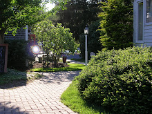
above are three examples of distinctive yet balanced living spaces
featured in architectural digest magazine

FOLLOWING is one dominant method, common across the design world, used to manipulate a space for psychological purposes. it uses prominent elements to create either harmony and tranquility or energy and tension. also, it is used to emphasize a particular interest or focal point.

balance and symmetry:

THE EFFECTS of balance in a room are relatively intuitive. people often notice when both small and large features of a space are off-balance or out-of-sync. they may feel ill-at-ease, tense, anxious, or agitated.

IN ANCIENT times mirror symmetry was considered the ideal. classical greece, for instance, was renown for its mastery of balance in art. the designs that came of this time and place continue to be highly regarded and praised for the simplicity and perfection.

above is a nice example of the classical greek symmetry from OntarioArchitecture.com

TODAY, architects, designers, and decorators still seek to achieve ideal balance. also, though, they desire their work to have an energy that is difficult to attain through classical styling alone. thus, it is through both absolute or mirror symmetry as well as more subtle methods that they hope to capture this feeling and to create peace in or through their designs. regardless of the chosen approach, the intended effect is consistent.

symmetrical
traditional balance in which similar objects or features are repeated across a vertical axis, such as in a mirror. perhaps because this is like the symmetry of the human form, it is typically the most natural and comfortable:

above comes from mainecottage.com

above John mark power's blog

above was a feature in traditional home magazine

asymmetrical

despite the obvious allure of perfect symmetry, asymmetrical balance is far more common in current design. to achieve it, visual weights are given to dissimilar objects and features before they are placed within the space. while this is more difficult than mirror symmetry, the effect is worthwhile. it creates harmony and unity while maintaining a certain easy energy that feels natural and effortless:

above was featured in metropolitan home magazine

above is a Modern Penthouse in NYC by Joel Sanders Architect

radial symmetry
rather than being achieved through placement of elements over a vertical axis, balance in this case comes by way of arrangement round a center point within a space:


above is an example of radial symmetry in a kitchen design from
john mark power's blog

A SPACE can also achieve a maximum psychological impact through structural design features such as angles, borders and edges and openness or spaciousness.


Monday, April 19, 2010

COLOR in DESIGN

Below are some of the fabrics found in design center showrooms at, for instance,
Stuart Swan Furniture, Hollywood at Home, and Pierre Deux.
They illustrate the wide range of colors available for interior design!


There is and has always been a fascination in the design world with COLOR. Even within the field of Organizational Psychology there is a sub-specialty that focuses entirely on color and its effect on behavior and performance.

Color psychology, however, is far from an exact science. It is a relatively young area of investigation and a rather difficult one, for a few reasons, in particular. TWO of these reasons have to do with human vision and cognition:

1. No two people see colors in quite the same way. That is, everyone perceives color differently. While these differences may be subtle, they are sufficient to ensure that the response to a decorated space is also unique.

2. The way people perceive color is directly related to personal experience and memories. Individual responses to the colors used in a space will depend as much on their evocative power as it will on the scientific process of color perception.


ABOVE is a photograph of a home in London. It's a great example of an unconventional use of color that may suit some but not others!

ABOVE is another great example of highly individual use of unique colors in a space, from Tipy.pl

The FINAL reason that color psychology is not entirely reliable is more social than it is scientific:

3. Different cultures employ and assess color in remarkably different ways. Accordingly, the associations made by viewers a decorated space and the reception of that space will be correspondingly different.


Above is an interior by Mario Buatta.
It's an example of a design influenced by both a specific time and place.


Above is an example from the site of a great design that is inspired by a Japanese aesthetic.
It is warm and modern as well as
recognizably regional.

With that said, below are just a (VERY) few of the general findings from the field of color psychology. They can be applied in a multitude of ways depending upon individual preferences and the desired effect.

NEUTRAL COLORS include whites, blacks, grays, and browns. These colors are relatively common and can be used in virtually any room. They're generally regarded for their calming effect, though, may also be considered to be boring!

These are two interiors that use neutral tones.
Above was featured in Traditional Home magazine,
Below from Architectural Digest magazine.
They illustrate the versatility of a simple palate.


WARM COLORS include reds, yellows, oranges, and pinks. Depending on the saturation, these may have different general effects:

......
1) Vicki Horton's ORANGE entry
2) Kelli Interior Design living PINK
3) YELLOW from birminghammail.com


COOL COLORS include blues, greens, and some purples. They are, for the most part, emotionally and physically relaxing. They can also improve productivity. Like warm colors, however, the specific effect also depends largely on the saturation of the tone.
A BLUE bedroom featured in Architectural Digest.
The top choice for bedroom decor...

A
BLUE kitchen also featured in Architectural Digest.
It should be noted that some believe blue acts to suppress the appetite...

...so this may be the kitchen of a dieter!

DARK COLORS, whether warm or cool, generally make a space feel smaller than it is. In a large room this may be employed to make it feel cozier, while in a smaller space it can lead to a sense of being closed in.


A DARK interior from a Malaysian showhouse

COLOR COMBINATIONS are often chosen to reflect a personal preference, though, some are generally more popular than others. For instance, a palate of brown, orange, and avocado was popular during the nineteen seventies and is once again emerging as a favorite amongst designers. Also, cool blues and warm yellows are commonly seen in current design magazines. Both combinations employ classic tones along with more vibrant colors for add energy and warmth. Also, it may be used in virtually any space, from living room to powder room.


A BLUE and YELLOW French country Pierre Deux interior


Note: In each of the above categories the colors have been pluralized. This is because each family has a virtually limitless range of slightly different tones and shades, which, again, contributes to the difficulty of color psychology. It is pretty unlikely that the color a stylist chooses is a perfect match to the one used in a study!

Friday, April 9, 2010

Texture & Pattern

Below are a few of the beautiful patterns designed by Emma Bridgewater. The designer's products have long been adored for their color and style!


DESIGN: The Basics
When the decorated space is broken down into its most basic components, the general elements that emerge are pattern, color, and shape. If those parts are examined more closely, with even greater precision and a more expert eye, additional distinctions can be made, and the categories can be described in further detail.
To illustrate this concept, we can begin by examining PATTERN.
In interior decorating, pattern comes in many forms and from diverse sources. That is, it may be in the fibers of fabrics, the treatment of painting, the surface of objects, or the inclusion of the objects themselves.

Historically, pattern has been used for a variety of purposes. The artful use of pattern enables communication, sets a tone and even serves practical purposes.

Pattern conveys such information origin through its roots in a certain country or culture, social or economic status through its associations or quality, and ritual or convention through its traditions. Often times it is without knowing that we evaluate the pattens used in design and come to conclusions about the space. Below are just a few examples of this notion at work along with very brief explanations of the theory in action. These were also chosen because they are amongst our favorite products and designs!
This is the tartan of the University of St. Andrews, Scotland, from the Scottish Register of Tartans. It is an example of the way in which pattern work to evoke images of distinctive places or cultures.

This is a traditional French country toile pattern used on a Pierre Deux wallpaper. Again, it illustrates the evocative power of pattern when used in decoration.

In the above photographs, the first of a wedding scape at the Caneel Bay Resort and the second a vintage Jaguar, the crisp whites suggest the marriage rite. Although neither are indoor spaces, both use a traditional design to conger images of weddings.

Pattern not only communicates factual information, but also emotional. In many cases pattern can be used to enliven a space, to create a certain mood, or to inspire decisive action. Below, again, are just a couple of examples of this in practice.


The Academy Awards Architectural Digest Green Room at the Kodak Theater designed by Roger Thomas. Perhaps one of the best examples of pattern hard at work. Here, it becomes evident that a masterful combination of simple surfaces and smooth textures can very effectively elicit a feeling of serenity and warmth in viewers. In this case, the calming effect is not only pleasurable but also necessary!

Finally, pattern may be used to disguise both wear and tear and poor quality. This practical function is often used in family or public spaces. It may be seen, for instance, in ornate motifs or rugged textures.

The upholstery in this Brunschwig & Fils print advert exemplifies the type of print that would successfully disguise an average amount of wear and tear. Deep colors and a bold pattern help to make it a suitable choice in heavily lived in rooms.

This interior from www.standout-fireplace-designs.com, featuring a "cowboy country stone fireplace", serves as an example of one way in which pattern appears through textured surfaces. The rustic, rugged features of this design help to disguise imperfections resulting from age and heavy use.
When designers employ patterns, they do so deliberately and they commonly depend on trial and error to produce the intended effect. With a skilled eye and a keen working knowledge of each of the above concepts, they exploit pattern both aesthetically, to convey a certain message, and for practical purposes, appropriate for their intended use.